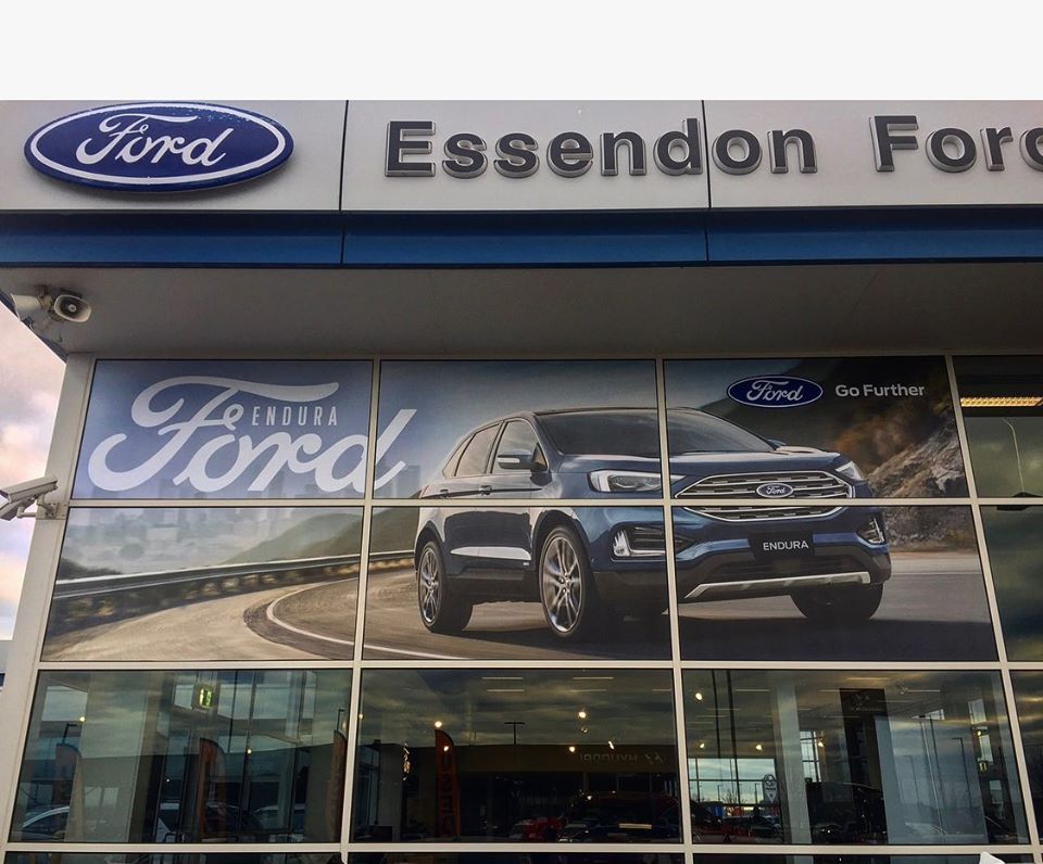
Warning! Are you sabotaging your storefront signage?
As a successful business person, you need people to come into your store to make purchases. However, it’s possible that you’ve got about it all wrong and things don’t seem to be working well. It doesn’t matter if your store is on a busy or quiet street, the right details will attract your customers and make them buy from you. It’s only by doing this that they’ll come inside.
Perhaps it’s your goal to pass across a message, a temporary offer or you just want to let then know what you have for sale. The truth is that you have to do it properly for results. There are different ways to get it done. In this article, we’ll be taking a look at different ways to get people to like your signage.

Let each sign have a purpose.
Before deciding to just invest in some signage for your store, you have to decide what it will be for. An outdoor sign could be to show customers a new product or tell them about the availability of certain services. Don’t just put up a sign because everyone else is doing so. It has to define a purpose! A good way to give your signs a purpose is by looking to convey a message on the sign.
Let the sign be enticing.
People walking past your store should be able to see the sign and decide whether to come in or not. You have to do your best to entice them and make them trust you. Enticing the customers starts from the type of sign you use, its design and the message it carries. To add more life to your sign you can regularly update the message and include your personality in it. There’s no need to sound so formal. Invite people in and they’ll come.
Keep the sign readable.
The major problem with signs is that they’re just unreadable. If your signs are too hard to read, most people will go by it without even noticing it was there. You have to consider how readable your sign is by someone riding a bicycle, driving or just walking past. So, the size of the text must be easily readable from a distance.

Make use of contrasting colours.
The contrast of the font colour in comparison with the background which you use will determine how easy it is to read. A colourful banner may be a great choice but the effects of the sun’s glare can impair readability. So, if you plan on keeping your sign where it would be exposed to a lot of sunlight, contrast is your best friend. Avoid any pairing colours as they may cause problems in the long run. The five most visible colour combinations include;
- Black on yellow
- Black on white
- Yellow on black
- White on blue
- Green on white
Create a universal message.
Think of all the major brands in the world and they all have a sign which can be associated with them. The only way for your business to get to its targets will be to look to create a universal message to its clients. When the customers see your sign, what does it mean to them? Make use of the sign to pass a subtle message which sticks.

